Say Goodbye to Different Shades of Beige
Because of their painstakingly precise fabrication process, Signworks can boast a caliber of product unlike any other in the city. Establishing a quality all their own, each stage of Signworks' creation process takes steps to ensure absolute precision and quality such as priming their materials as well as utilizing a multi-prolonged approval process to ensure the best final product for their clients. According to Gaby Ryan, "there's quality control here. We're all checking to make sure everything is aligned right, everything is formed right, that the paint is right," right down to the last detail. Ninety percent of their signs are fabricated in-house, "so if someone calls us and needs something in a pinch, I'm going to help you," said Ryan.
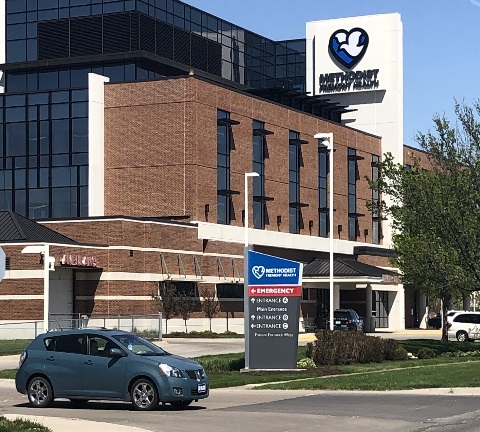
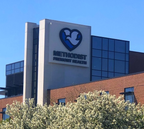
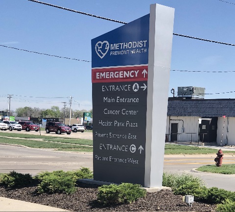
Because of their ability to construct such pristine work in the comfort of their warehouse, Signworks was tasked with refitting the entire Fremont Health System with signage when it merged with Nebraska Methodist Health System to become Methodist Fremont Health. This meant that the Signworks team had to hit the ground running on replacing everything from large signage on the building itself down to directional signage, parking signage, and finally interior signage within each clinic like outpatient, surgical group, care for women, cardiovascular, and family practice clinics one might see within a typical hospital system.

Approaching the project with a top-down approach, the team at Signworks had to craft the latest building signage first and worked their way down in layers to include directional parking, and finally interior signage within the buildings themselves. Currently, according to Ryan, "we're putting signs on doors that say, 'afterhours access.' That's how it works, it's a trickle down. We get to work with the client on the outside work and then onto the inside." In this case, Fremont had a pre-exisiting brand which was able to be retrofitted with their new designs, allowing for a better value for the client as well as the added environmental benefits of avoiding having to construct a new foundation from scratch.

Signworks was able to bring elements of the Methodist logo into the Methodist Fremont Health design for an easy compromise that pleased both the client as well as their community. Ryan explained, "the Fremont people really wanted to keep that connection to Fremont Health, so the brand that they came up with is the heart and dove logo in the standard style for Methodist," along with the black Methodist lettering to create Methodist Fremont Health.
To create their new signage, Signworks' team went through the precise process of photographing current structures, taking exact measurements, and presenting possible design options before going through an approval process that covered everything from font size to paint hue before fabrication. Their team of seasoned fabricators then visited the sites themselves to determine how the current structure could be retrofitted with their new creation so that, according to Ryan, "when we send them out for creation, we are all on the same page." Once they completed Methodist Fremont Health's massive outdoor signage, Signworks moved onto the clinics and finally interior signage, working all the way down to directories and directionals.

Whether your business is a startup or a system like Methodist Fremont Health, the team at Signworks has the precision, dedication, and experience to create a product to last a lifetime. For more information on Signworks and their current projecys, visit signworksomaha.com
POSTED IN: Illuminated, Exterior, Monument, Healthcare, Channel